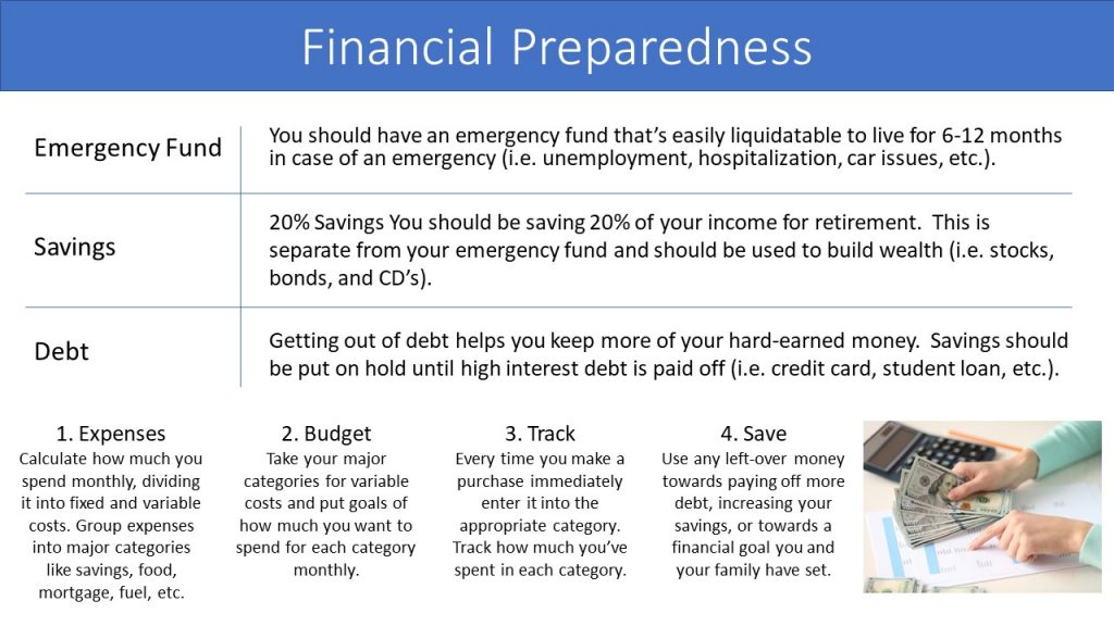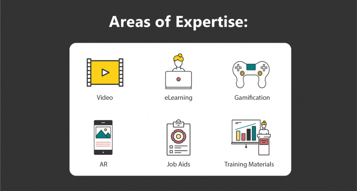
How often have you seen training, communications, or presentations like this?
What are your first thoughts? “Look at all that text!” “Why the random picture?” “This must not be important if they put this little effort into the design.”
It is all too common to see little thought or effort being put into graphic design. But that is a big mistake. Design plays a significant role in telling your story. So where do you begin if you have little to no design experience? Here are 6 quick steps to great graphic design.
1. Condense the Information

Use as few words as possible to get across the information. This is especially true if audio or a presenter is accompanying the content. Focusing on key points is the best way to ensure your audience retains what is most important.
2. Find Design Inspiration

There are many places to find amazing design. Just search the internet, skim magazines, look at billboards, etc. Note what you like about different layouts. How are the text and images arranged? In what ways does the imagery convey the message being presented? What colors and fonts are used? Use this as a starting point for your design. My favorite places for inspiration are Behance, Awwwards, and Dribble.
3. Purposeful Visuals

Images thrown on a page with no purpose hurts your design. Use visuals to replace or summarize text. They can also be used to convey your overall message or elicit a specific feeling. Never mix different styles of imagery, unless you know what you are doing. For example, don’t use cartoony clip-art in one area and then use an elegant photo on the same deliverable.
4. Layout

There should be an easy to follow hierarchy that guides the viewer’s eyes through your content. Your audience should automatically know what is most important to what is least important by how your text and images are arranged. Use white space (an area without text or graphics) to divide or highlight information.
5. Contrast

Use different sizes, colors, and thicknesses to indicate where viewers should look first. This will make following the flow of your layout easier. It also makes your design much more interesting.
6. Alignment

Nothing should be randomly placed. Each visual should be aligned to the page itself or another visual. In addition, make sure all the text is aligned the same way.
Following these steps will improve your graphic design, better tell your story, and help your audience retain your message. If you need more design help, visit Krogel Media or contact us at solutions@krogelmedia.com.
